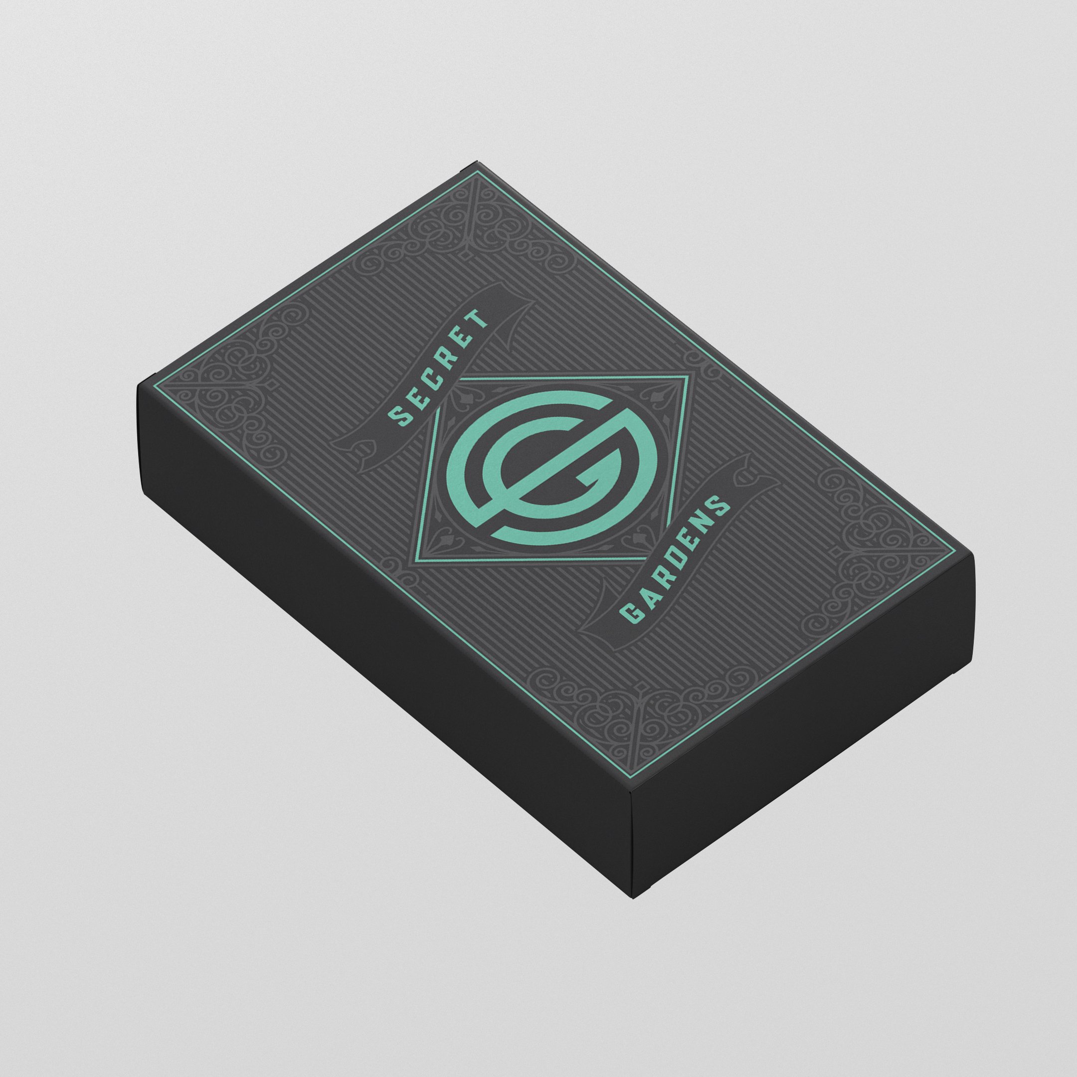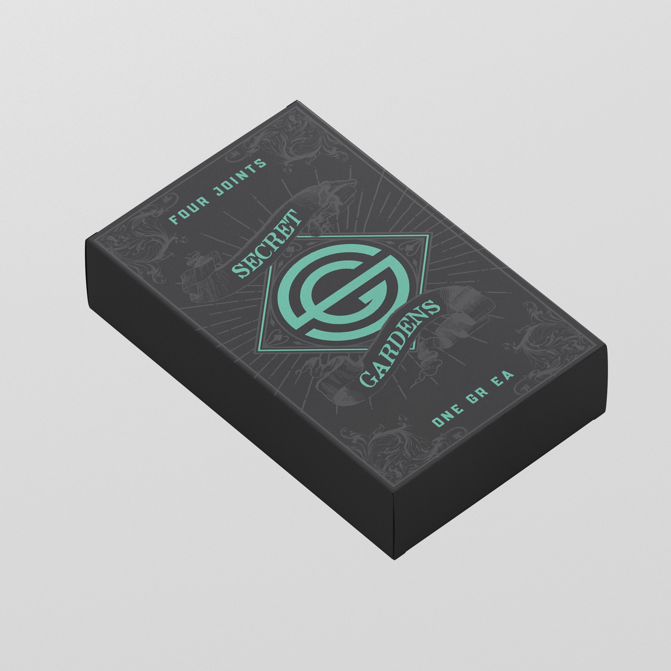
Luxury in packaging isn’t just about aesthetics—it’s about sensation, contrast, and the way light interacts with form. When tasked with elevating a small pre-rolled joint package into something premium, I focused on the subtle interplay of materials and finishes to create depth and intrigue.
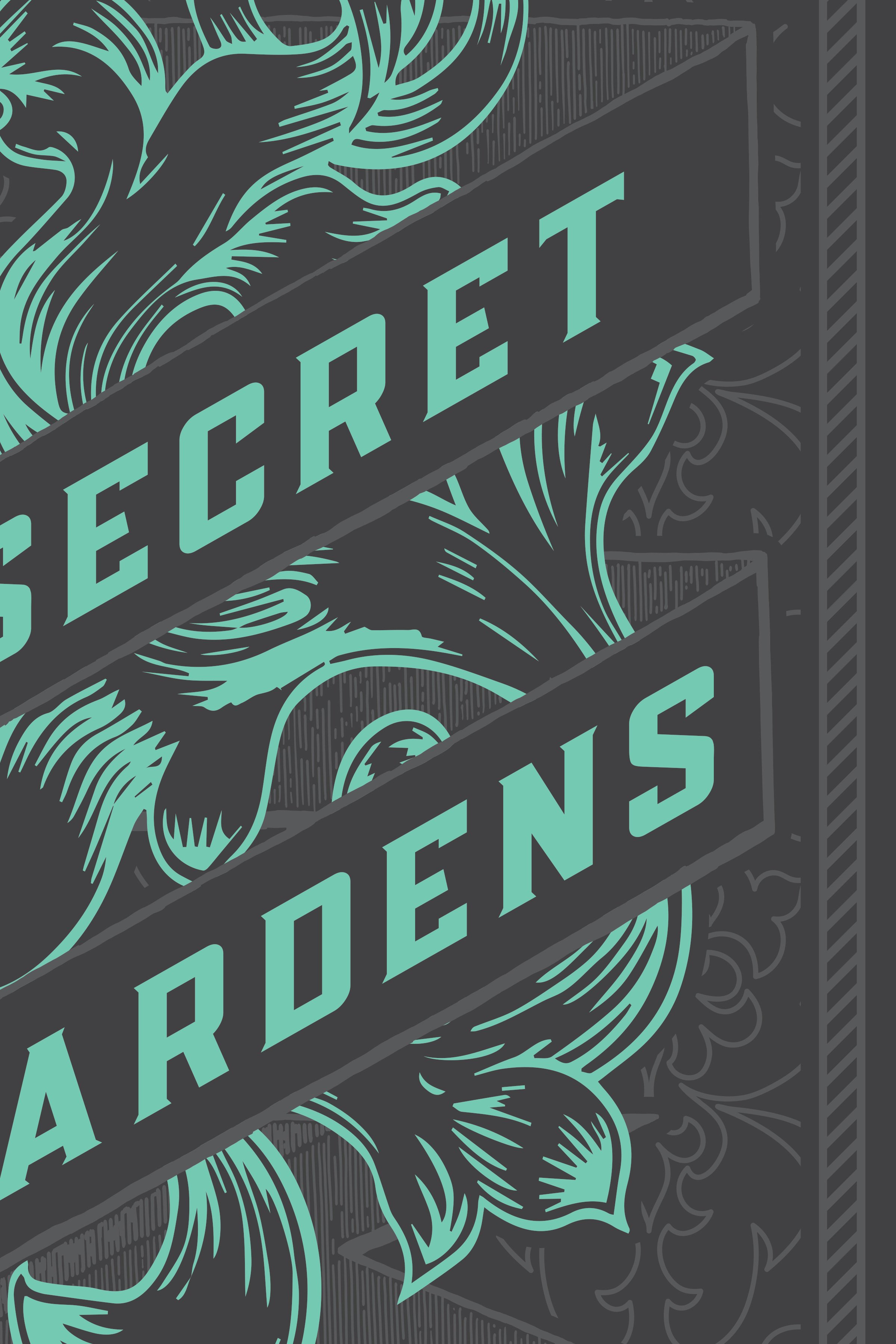
Using the brand’s signature mint green as an accent, I designed a series of illustrations meant to be foil-stamped in a tone-on-tone execution. The choice of a matte material gave the package a refined, tactile quality, while the gloss foil stamping introduced a dynamic contrast—catching and reflecting light differently depending on the angle. The result was packaging that wasn’t just seen but experienced, shifting between understated elegance and bold definition as lighting conditions changed.
This wasn’t just about housing a product. It was about reinforcing the brand’s identity through every detail—an object that felt as carefully crafted as what was inside.